Golden Slipper Camp
Art Direction • Conception • UI/UX
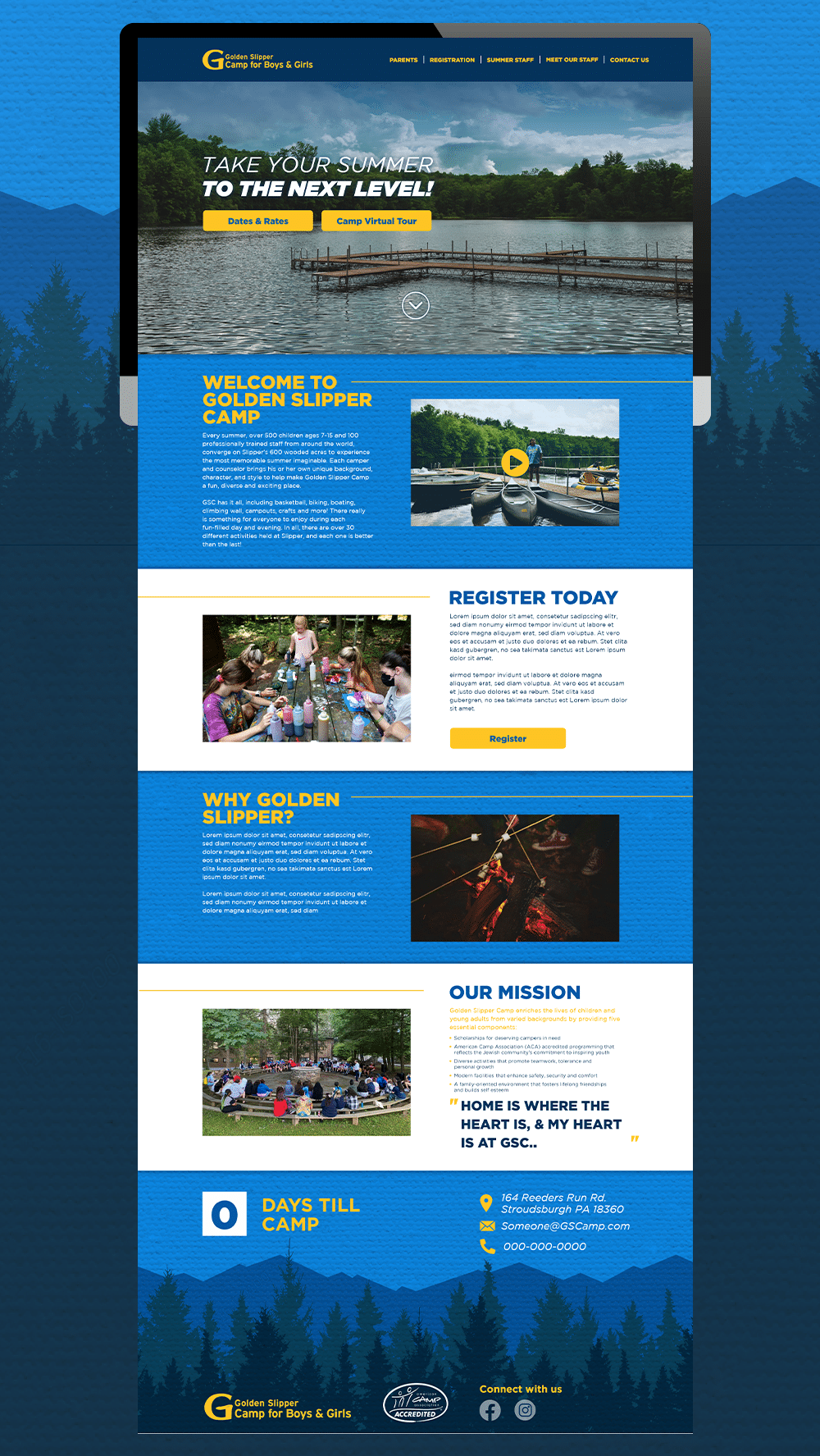
Golden Slipper Camp is an overnight summer camp in PA that has been around for 70 years. Unfortunately their website was outdated, confusing, and not mobile friendly. I volunteered to update the website to create interest for new families and camp alumni to send their kids as well as getting new staff to sign up to work for the summer.
Golden Slipper Camp has multiple stakeholders using their website: camp staff, families, and alumni. This required interviewing different demographics in order to identify and understand the major pain points of the current website. While each group had different specific requirements, they all expressed concern over the amount of pages to click through, and the considerable repetitive and outdated information.
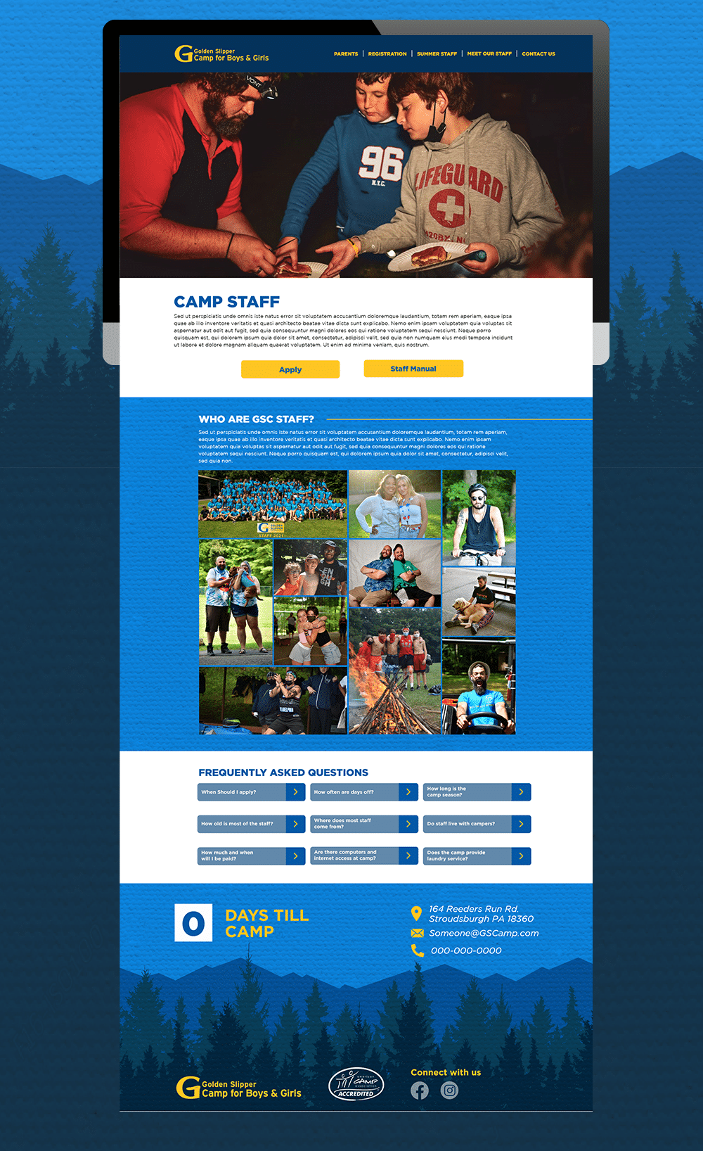
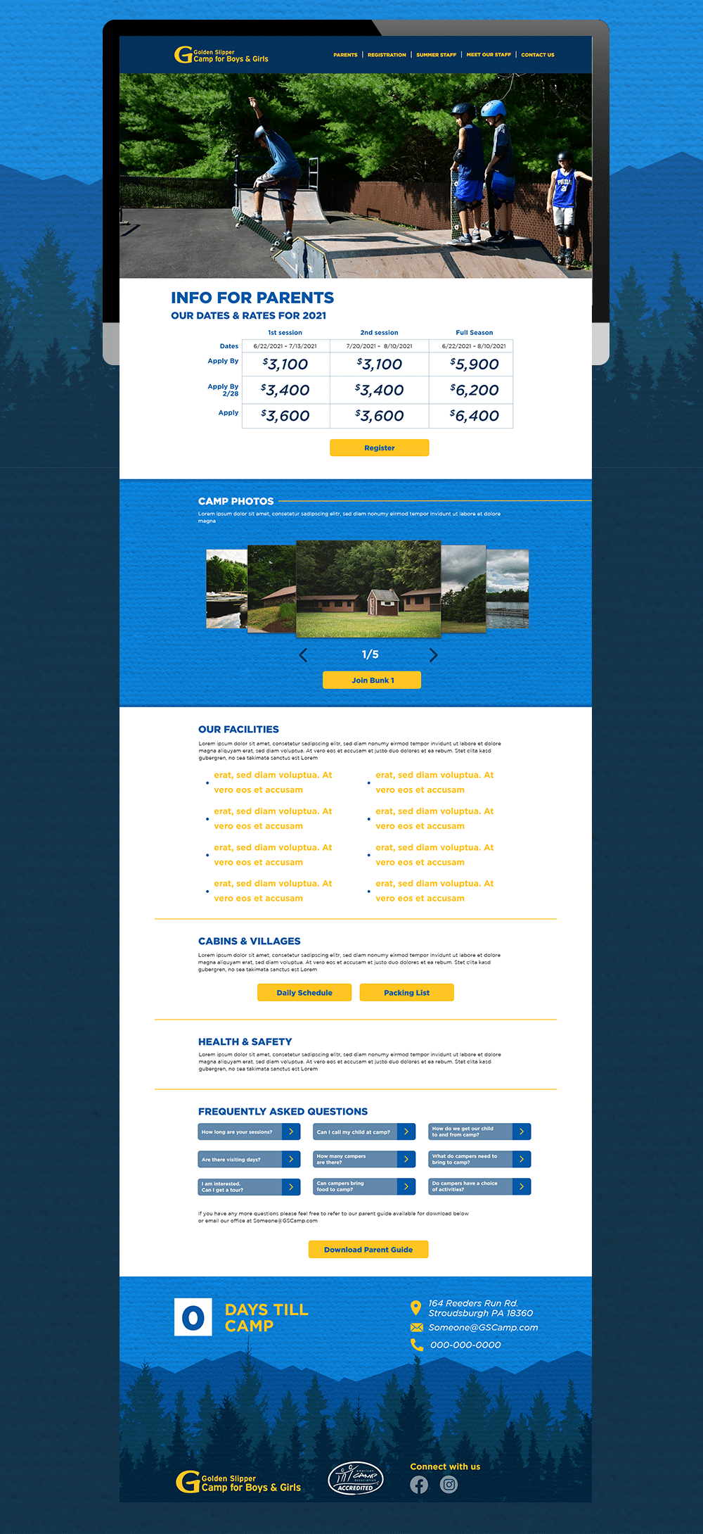
I then began looking at the analytics of where people tended to leave the website. Parents tended to give up searching for what they were looking for about 2 clicks in. For the parents who were successful, the information provided was sorely lacking, or found on other pages they did not navigate to. Overall, there was no clear site navigation regardless if you were a parent or an employee.
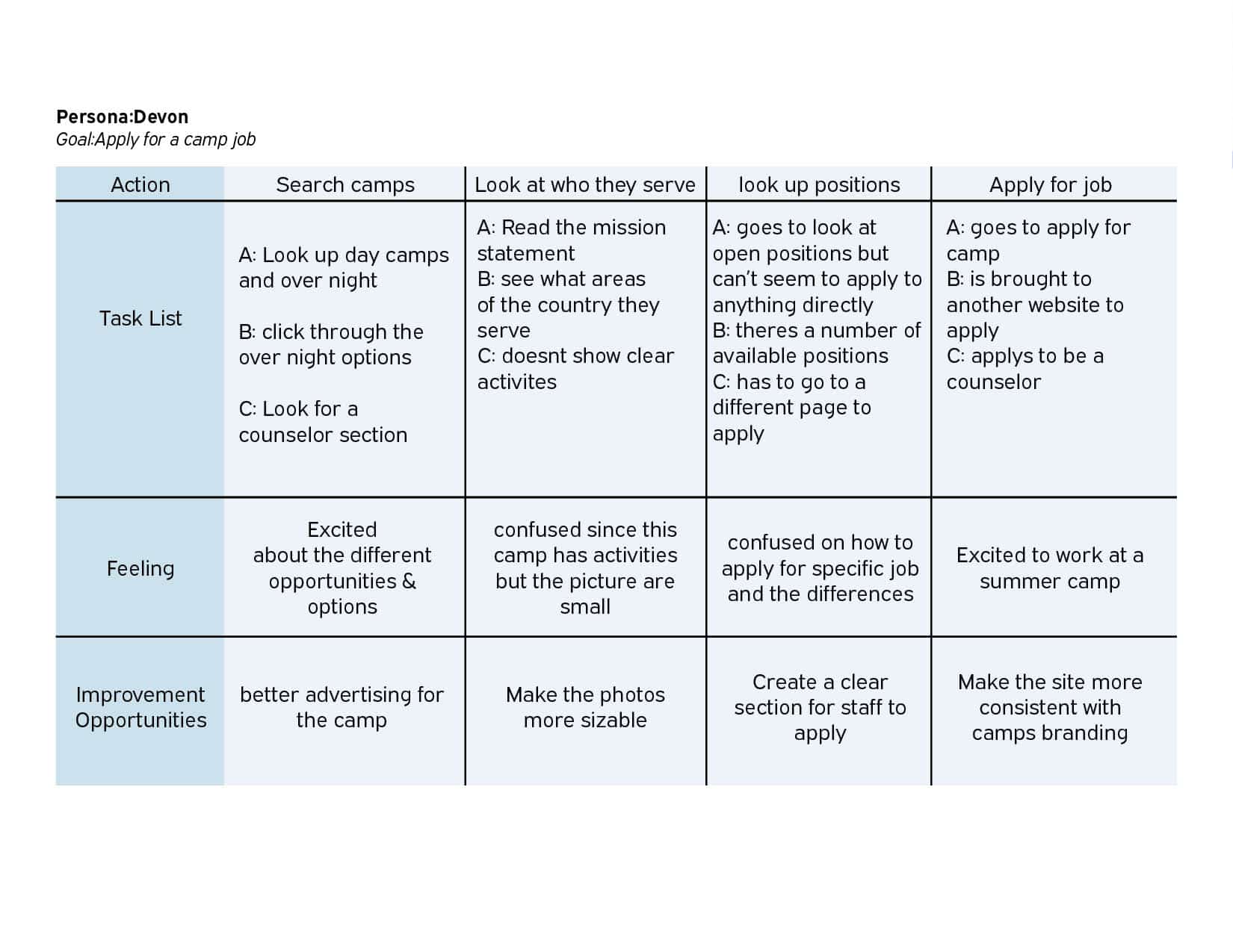
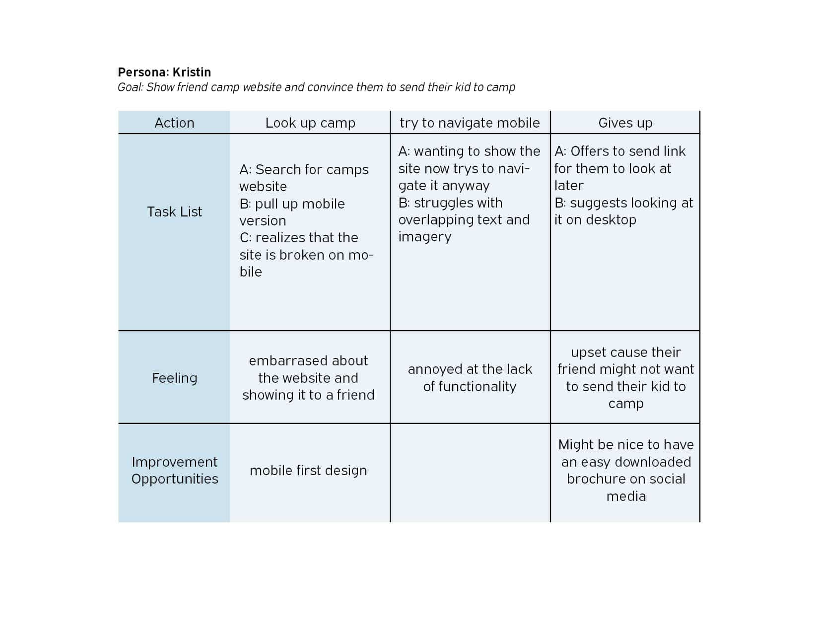
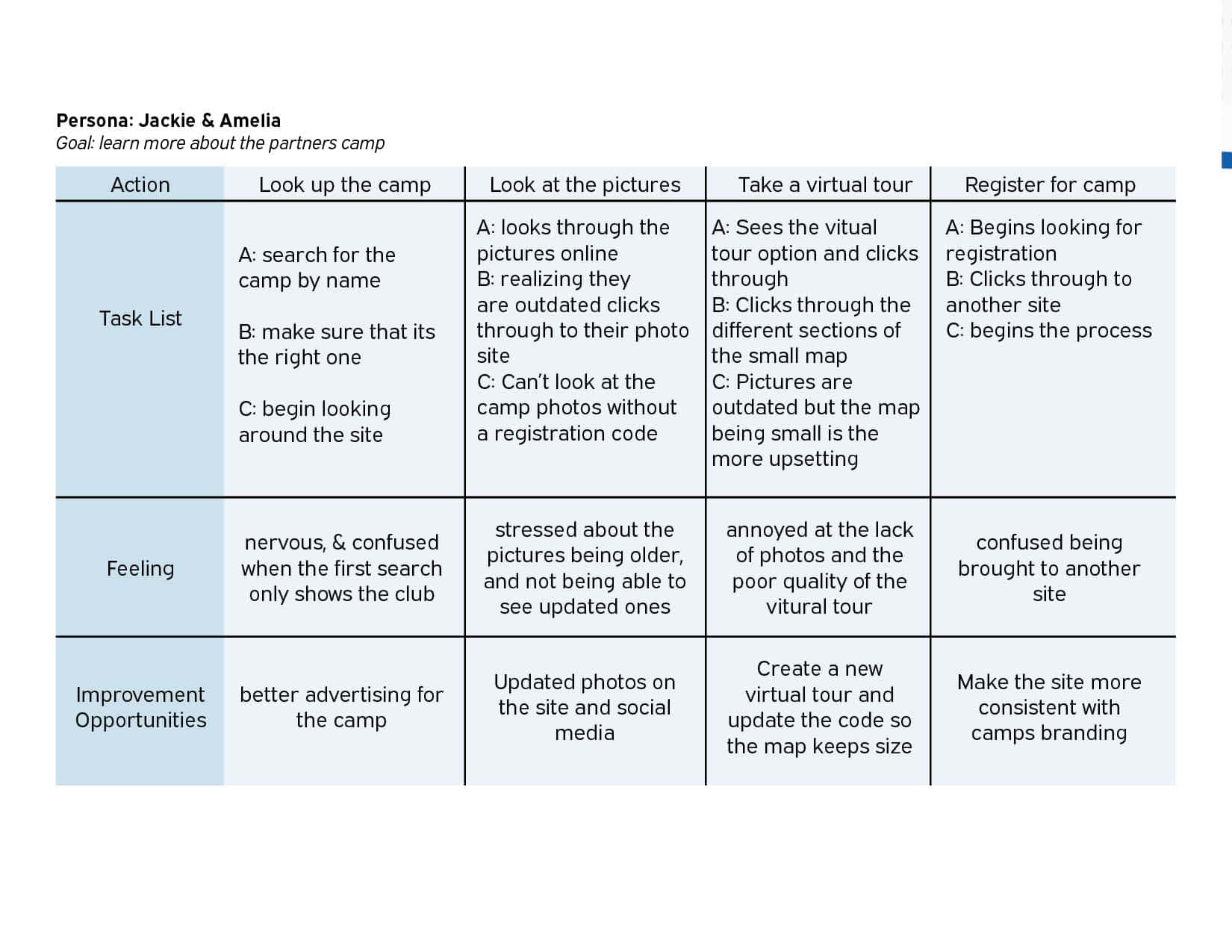
Personas
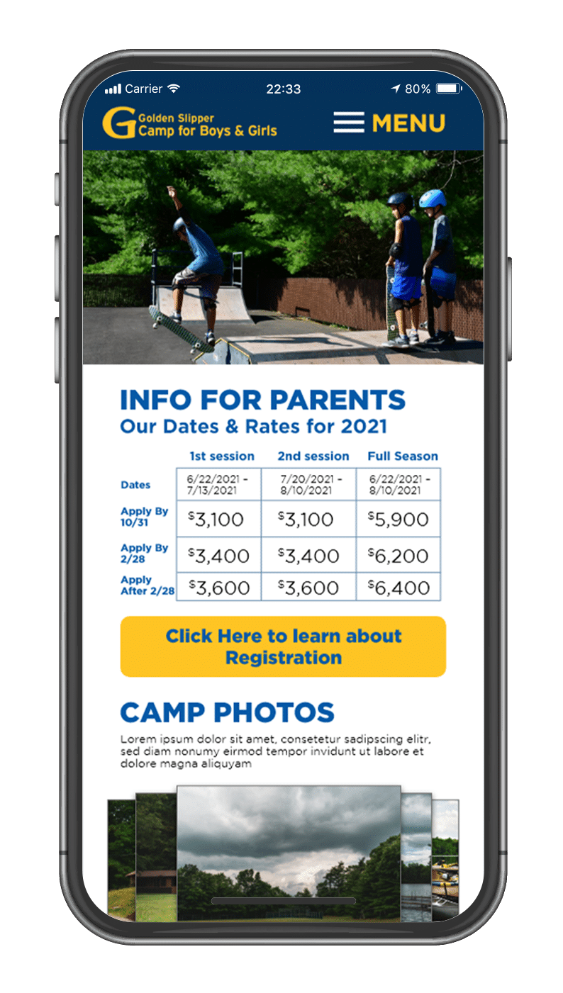
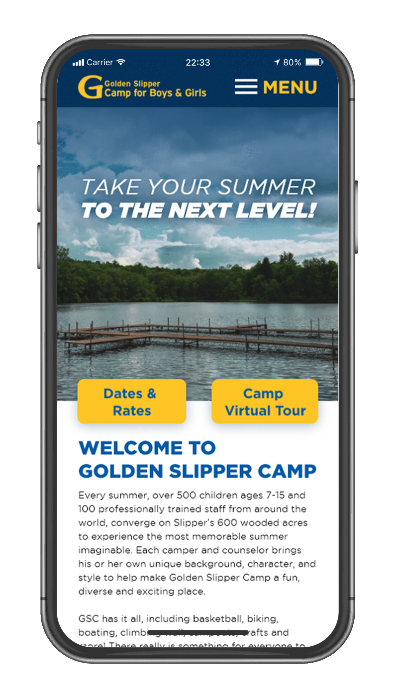
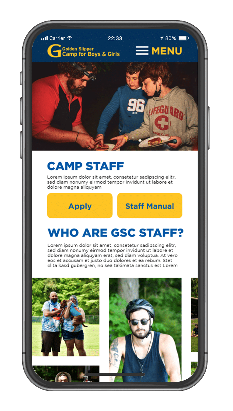
By creating personas of the different user groups I was able to focuse on what the clients really wanted and focus in on what was important to each group. For new parents it was a clear picture of what the camp looked like and felt like. For potential staff it was similar but also finding who the camp actually served camper wise. Finally for parents who have been sending their kids they wanted a mobile way to show the camp website, and look up the images on their phones.
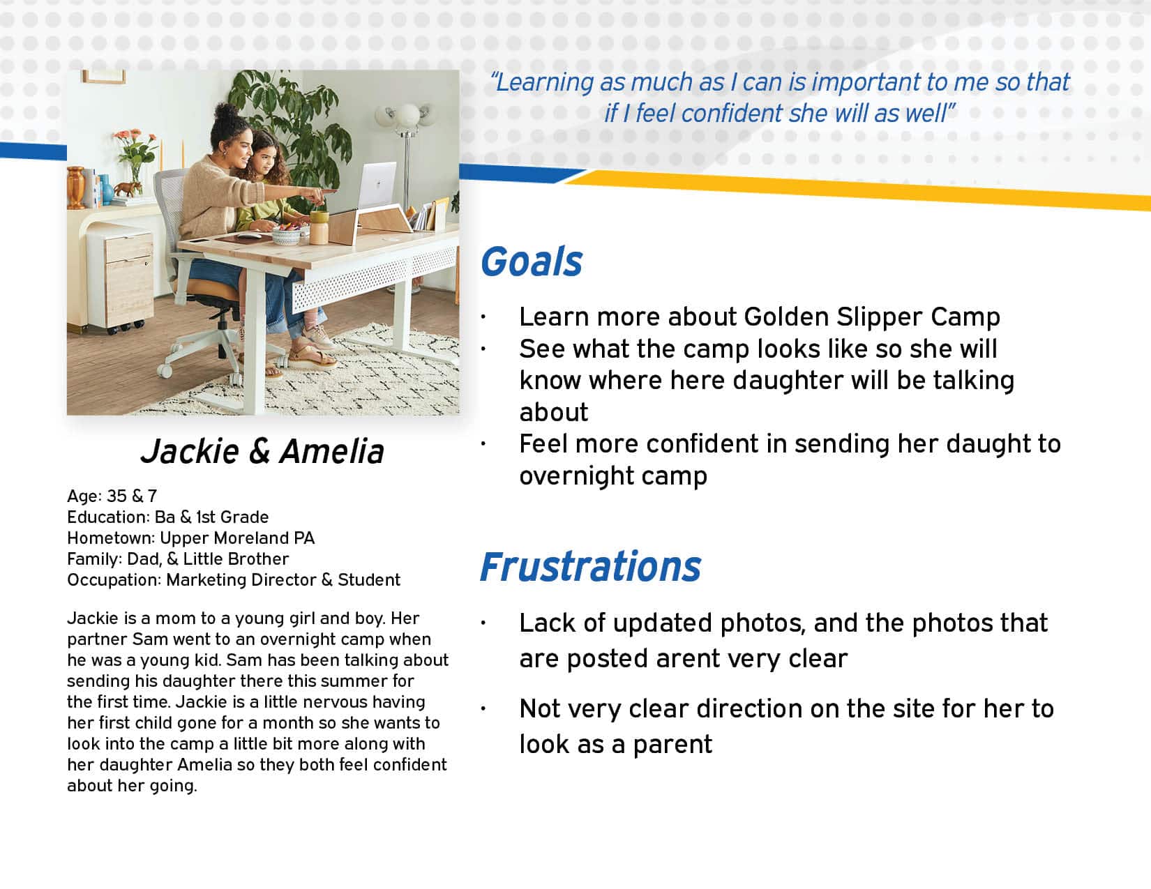
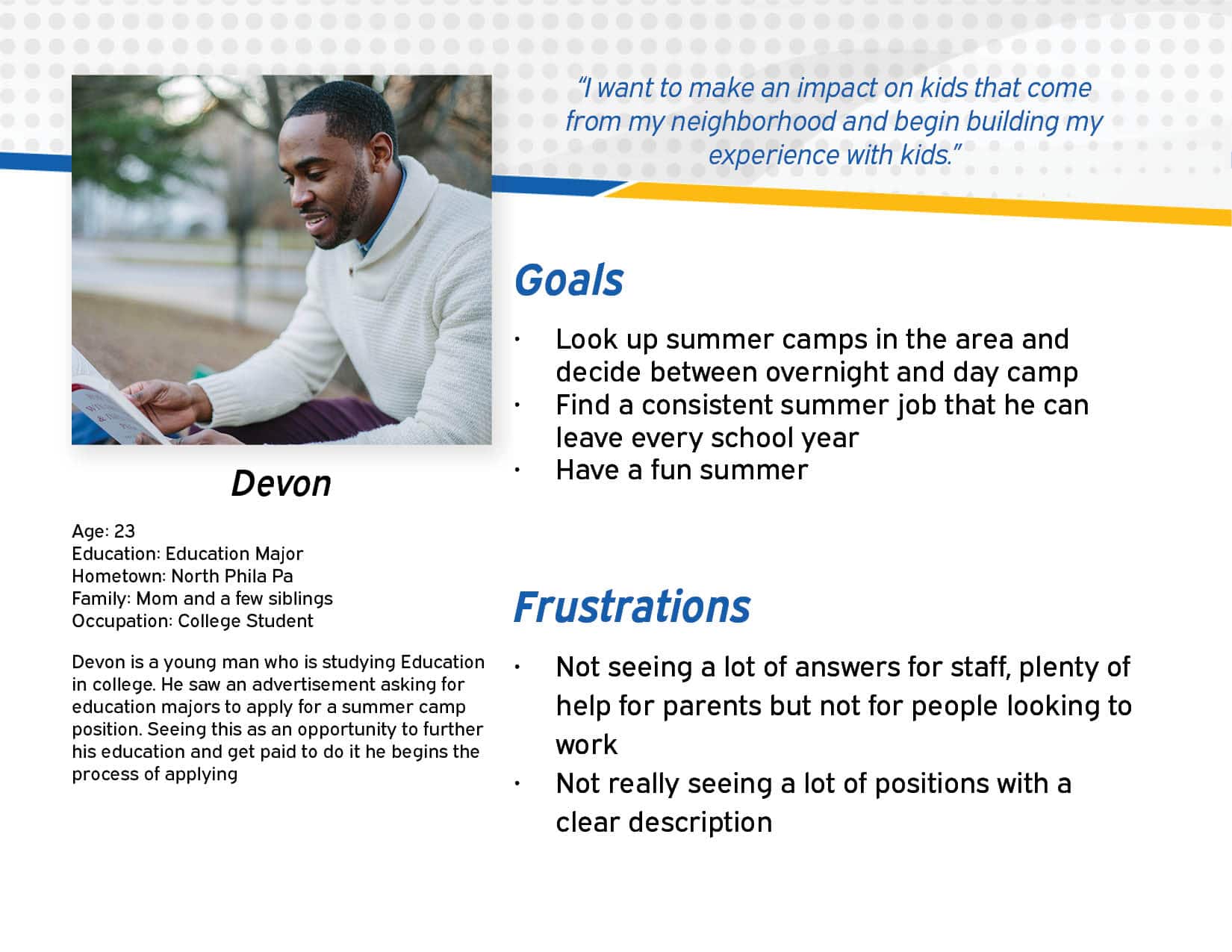
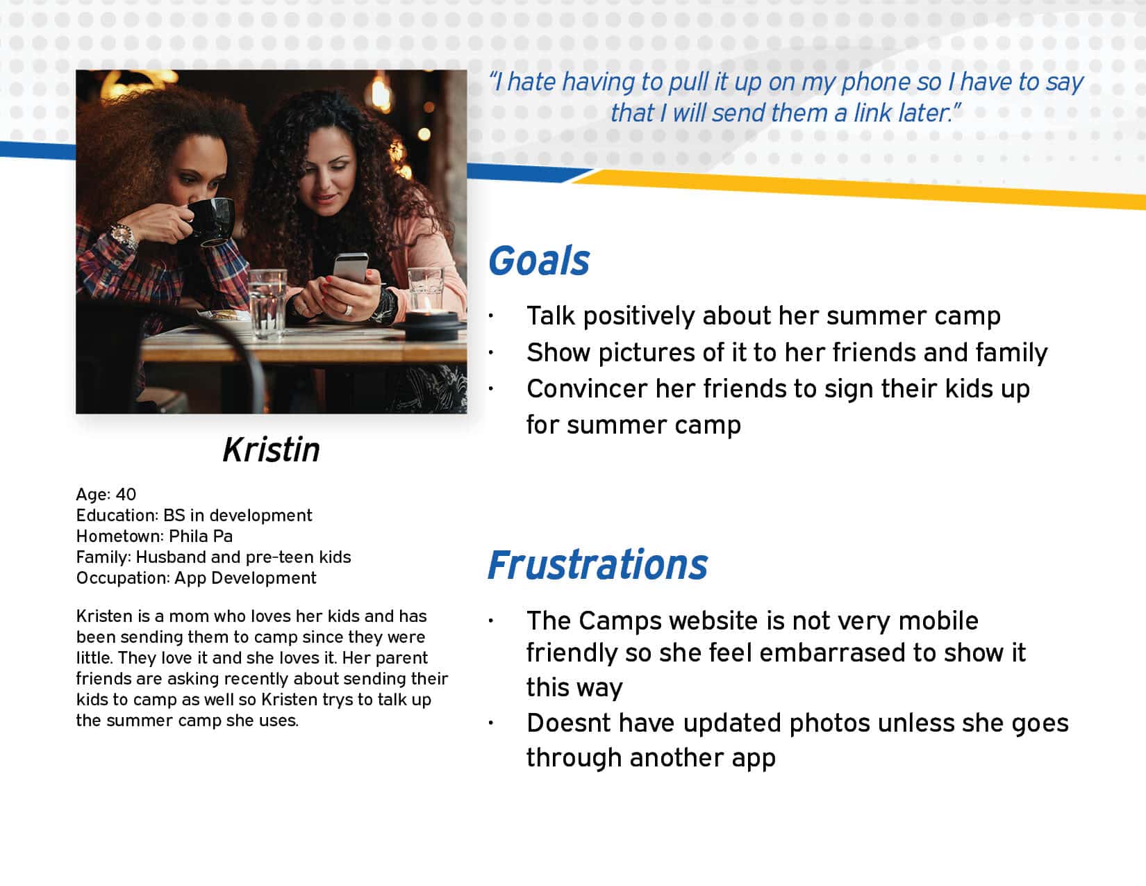
Part of making the personas was also creating a user journey to show to our stakeholders what the users were actually struglling with and how they felt about their experiences with the previous camp website. Alot of the struggles happened on the mobile site. Which made it clear this was our main focus for the new website. Also making the text less repetitive, and give a more straight forward explanations. Finally it showed we needed an easy way to update photos to keep up with them for new parents.
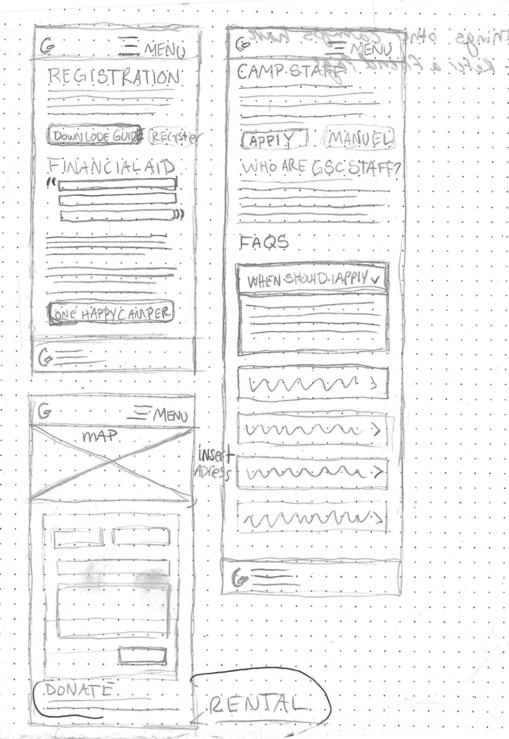
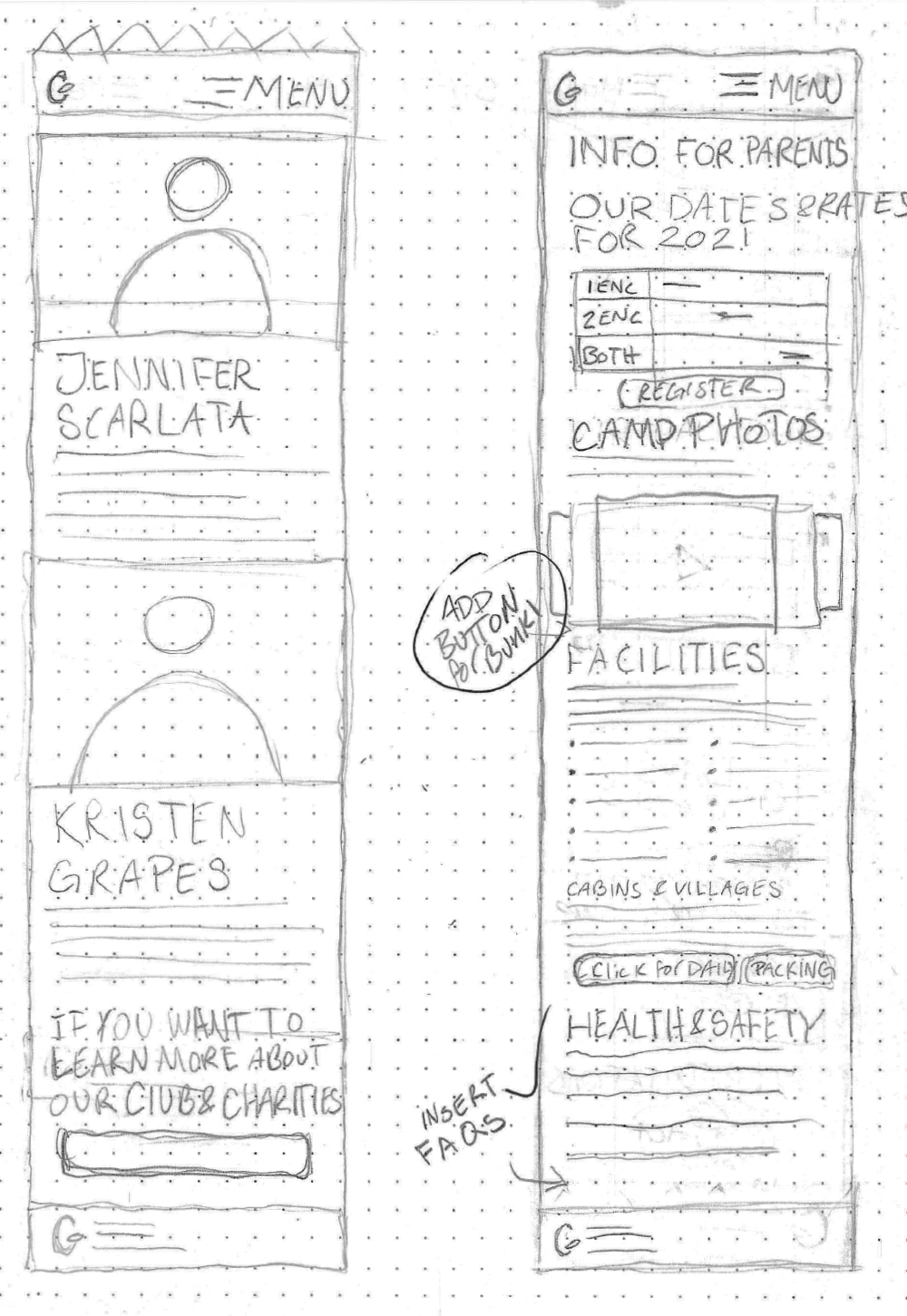
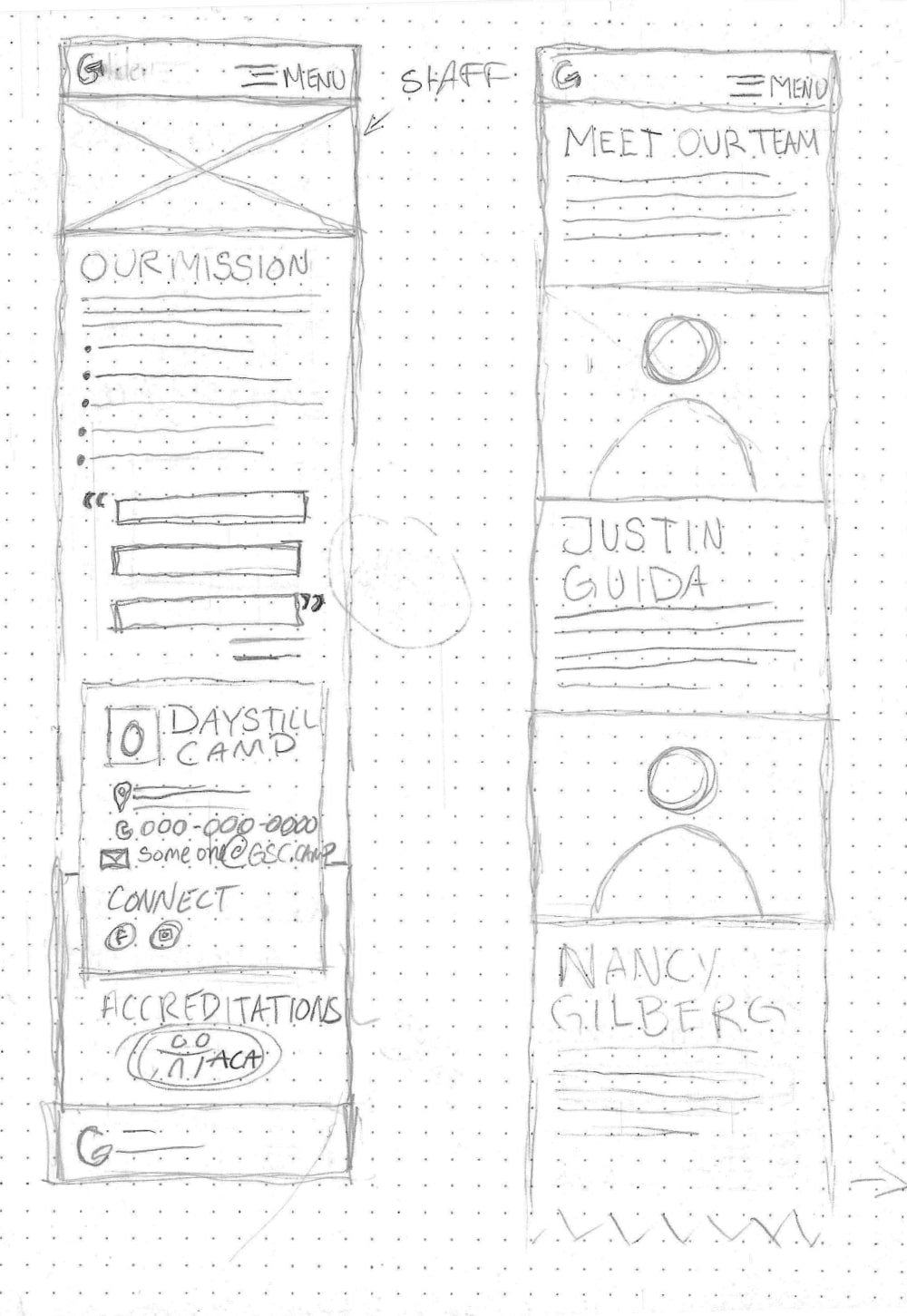
Site Map
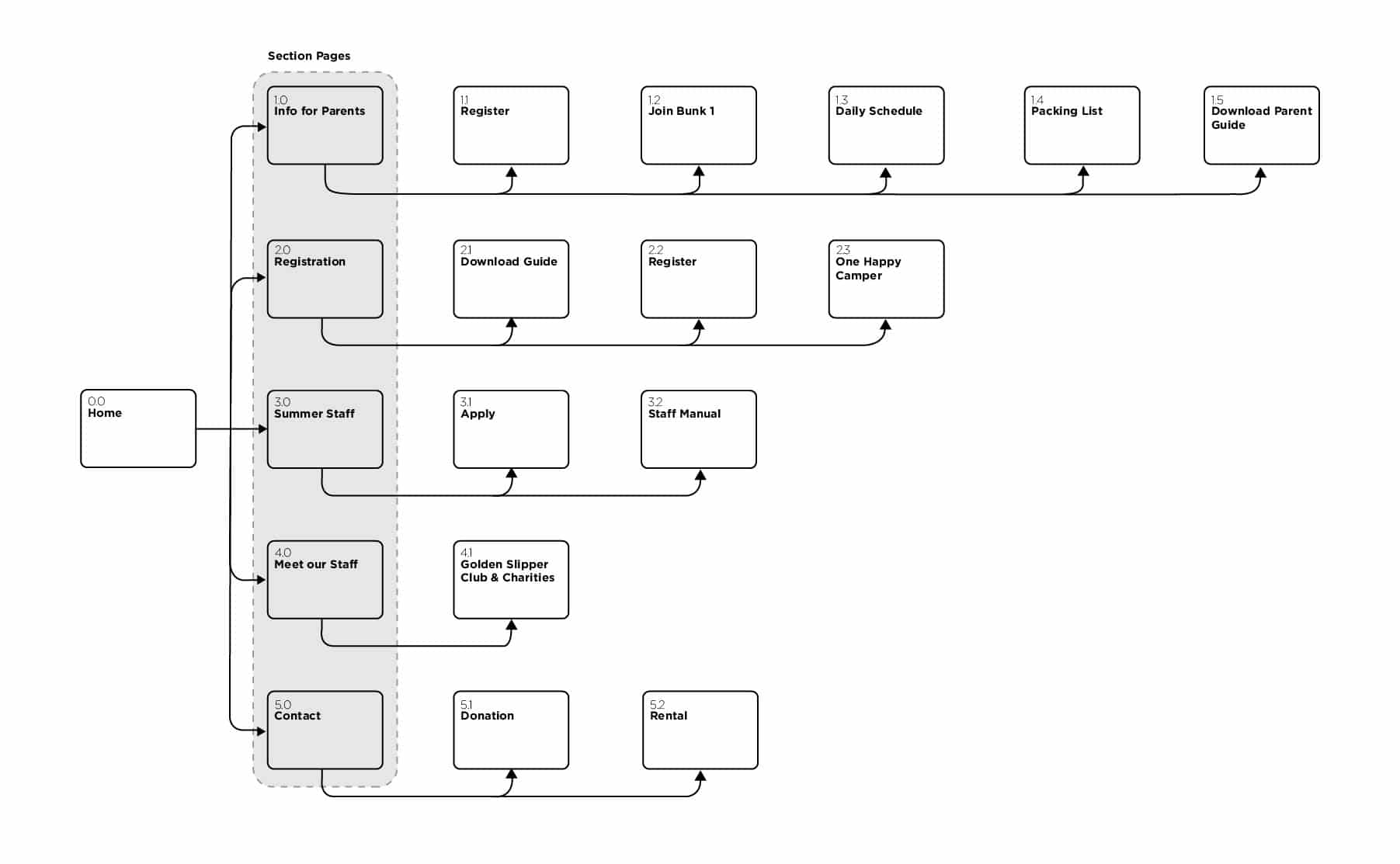
Utilizing low fidelity wireframes allowed me to rapidly test and iterate more impactful layout options with my focus groups. I increased overall site conspicuousness by giving targeted navigation to each stakeholder group, and ensuring registration and yearly schedules are easily accessible. At this time, I am still iterating through final feedback and revisions with the Golden Slipper board.